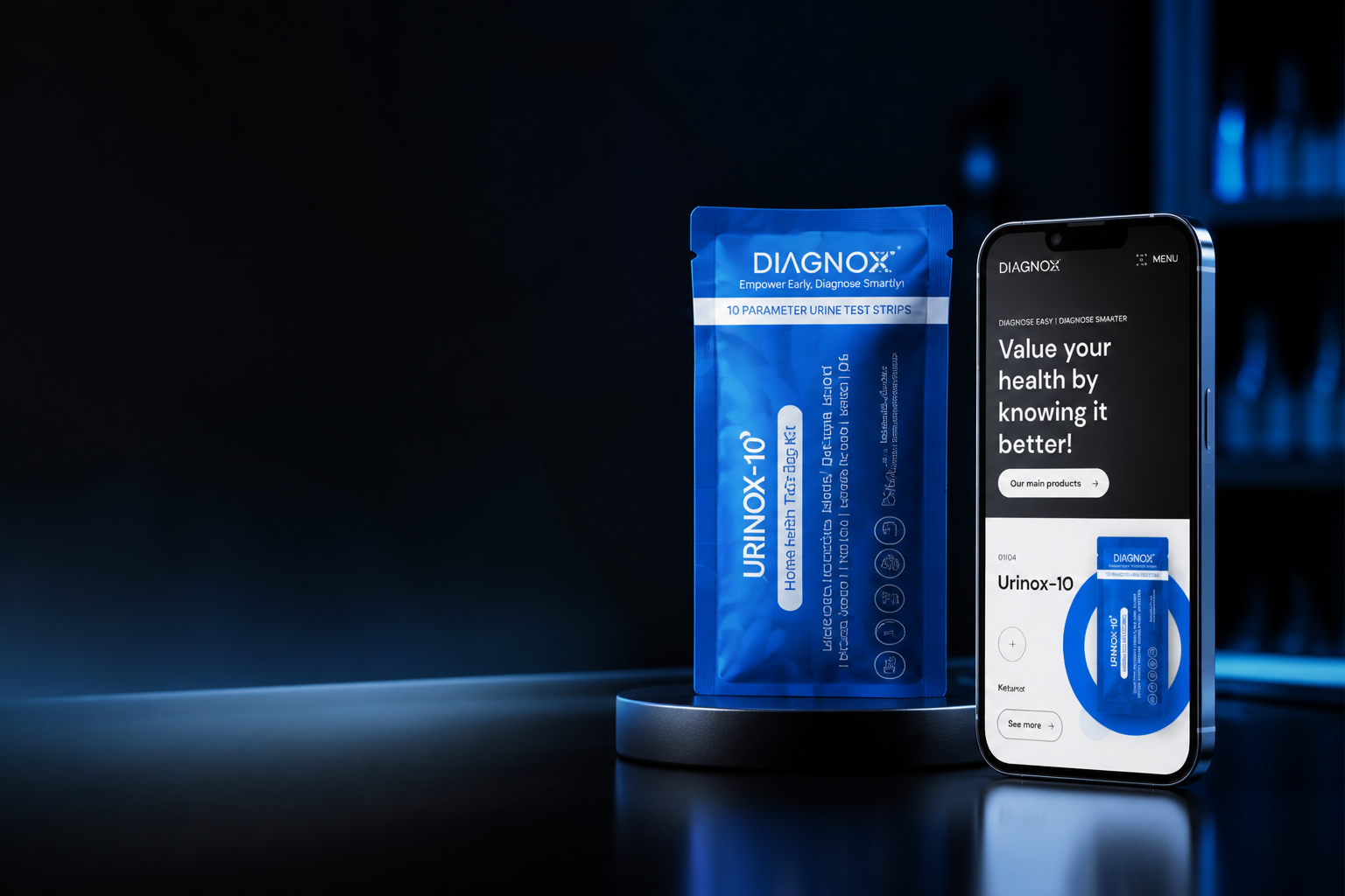
Diagnox home diagnostic product beside its responsive ecommerce product page
Healthcare commerce / diagnostic products
Case study / Healthcare commerce

Diagnox Health

I turned four diagnostic product families into a clear commerce system where education, trust and purchase intent move together.

Role UX strategy, visual design & buildDeliverables Commerce, CMS & interactionsPlatform Webflow & custom JavaScriptOutcome Client-reported 2× website sales
The design problem

Home diagnostics need more explanation than an ordinary product grid.

Each product speaks to a different health concern, testing method and level of buyer confidence. The experience had to introduce the range quickly, explain unfamiliar products responsibly and keep the path to purchase visible without reducing clinical information to sales copy.

Audience
People evaluating at-home diagnostic and health-monitoring products
Scope
Commerce UX, visual system, Webflow CMS and responsive interactions
System
Four branded product families connected by one commerce architecture
Build
Responsive Webflow implementation, CMS structure and custom interaction logic
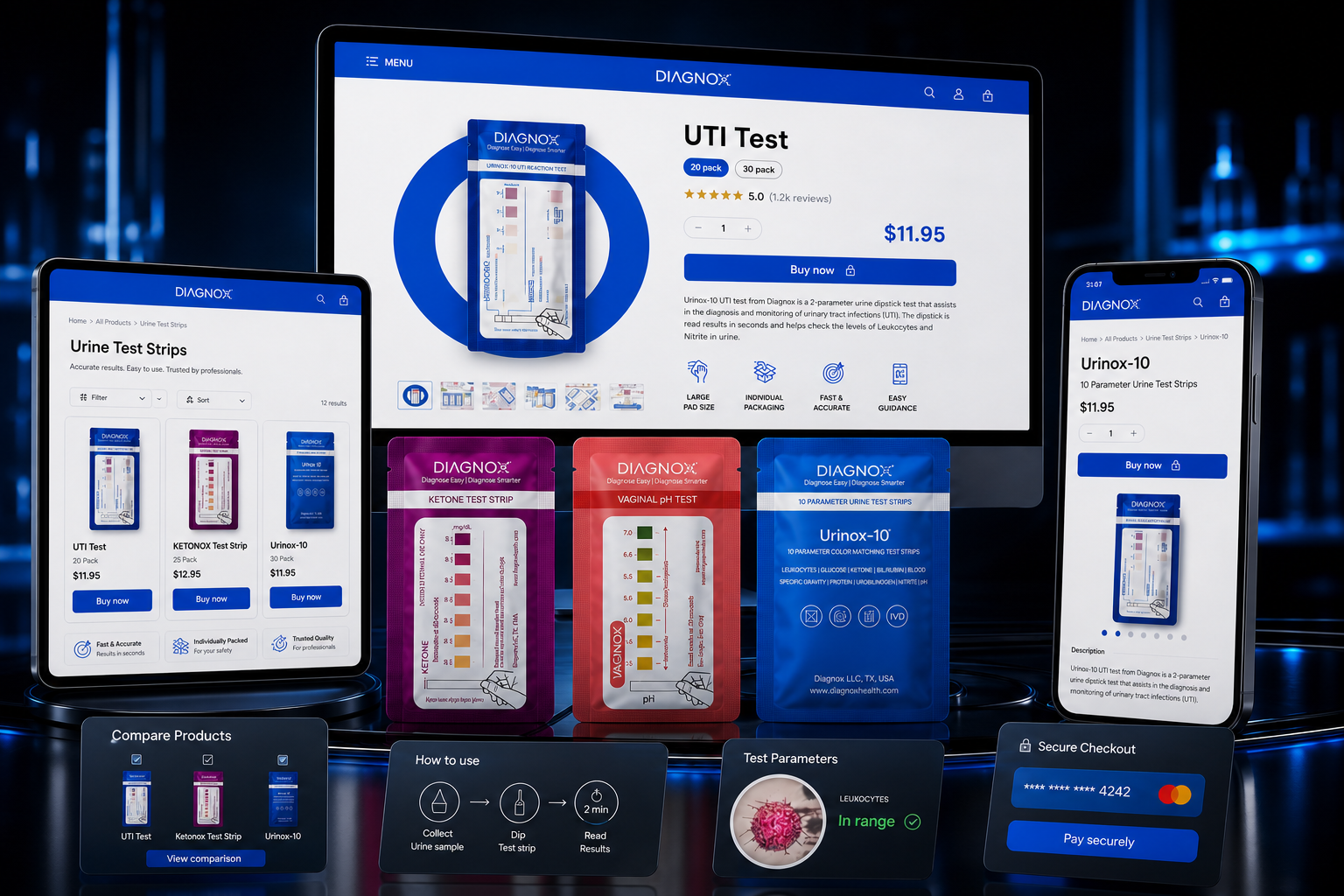
Diagnox responsive ecommerce system with product-detail shopping, diagnostic packs, product comparison, test guidance and checkout
Responsive commerce, product comparison, test guidance and purchase actions working as one website system.
Commerce principle

Clinical confidence comes before checkout.

I structured the journey around the questions a careful buyer asks in order: What is this for? Is it relevant to me? How does it work? What will I receive? What happens after the test?

01

Recognise

Product colour, pack and health concern establish the right route immediately.
02

Understand

Plain-language value, features and test parameters explain the product before detail expands.

03

Trust

Usage guidance, health facts, product evidence and customer proof reduce uncertainty.

04

Act

Price, quantity and purchase controls stay close to the product summary and supporting evidence.

Product architecture

One clinical grammar, four branded product worlds.

The structure remains familiar across the range while colour, pack imagery, health facts and support content make each family unmistakable.

Source product pagesResponsive Webflow system
01 / 04
01 / Urinary health

UTI Test

The route brings the health concern, product pack, purchase information, feature proof and usage guidance into one continuous page.
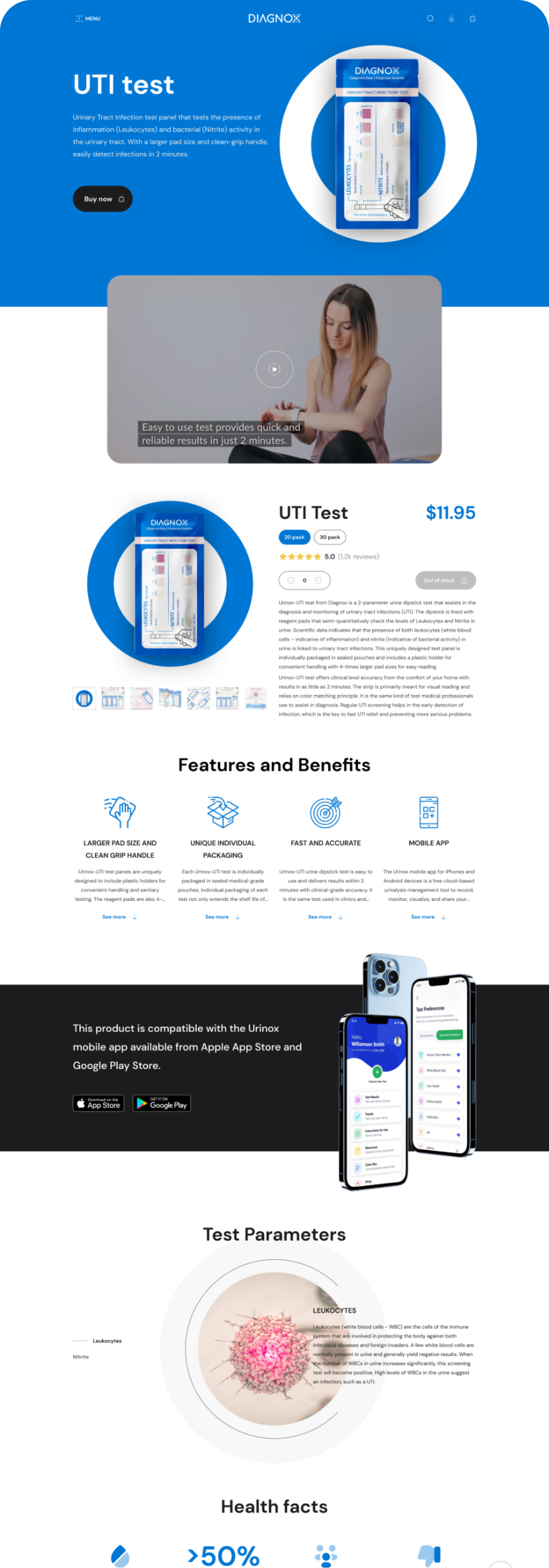
  • Immediate use-case recognition
  • Feature and benefit hierarchy
  • Test parameters and health facts
  • Product instructions and education
Figma source · 4× exportComplete high-resolution UTI Test product page from the Diagnox Figma source
Complete website route: purchase, benefits, parameters, health facts and instructions.
02 / Ketone monitoring

Ketonox

Magenta creates a distinct product signature while the shared page anatomy keeps buying and learning behaviour familiar.
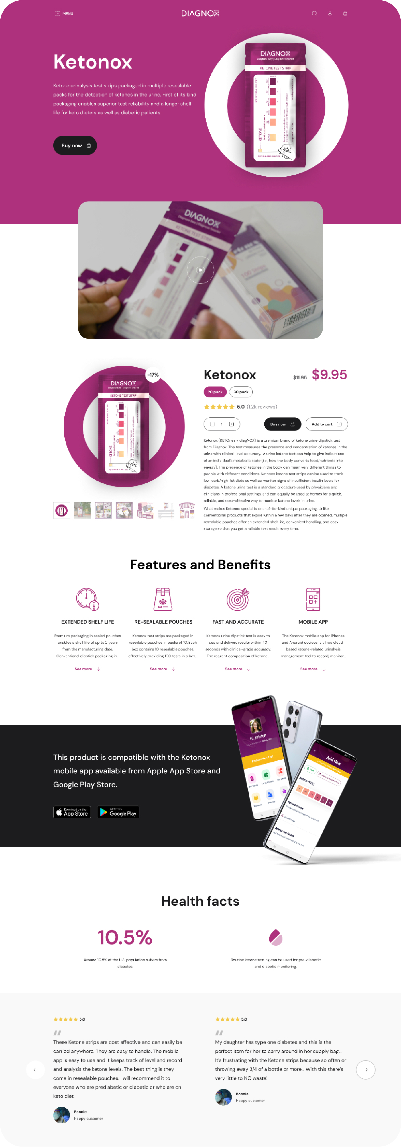
  • Product-specific video context
  • Pack and price near the summary
  • Feature system and product education
  • Health facts and customer proof
Figma source · 4× exportComplete high-resolution Ketonox product page from the Diagnox Figma source
The shared commerce framework adapted to ketone monitoring.
03 / Vaginal health

Vaginox

Coral softens the clinical tone while the page gives sensitive information enough space, sequence and visual clarity.
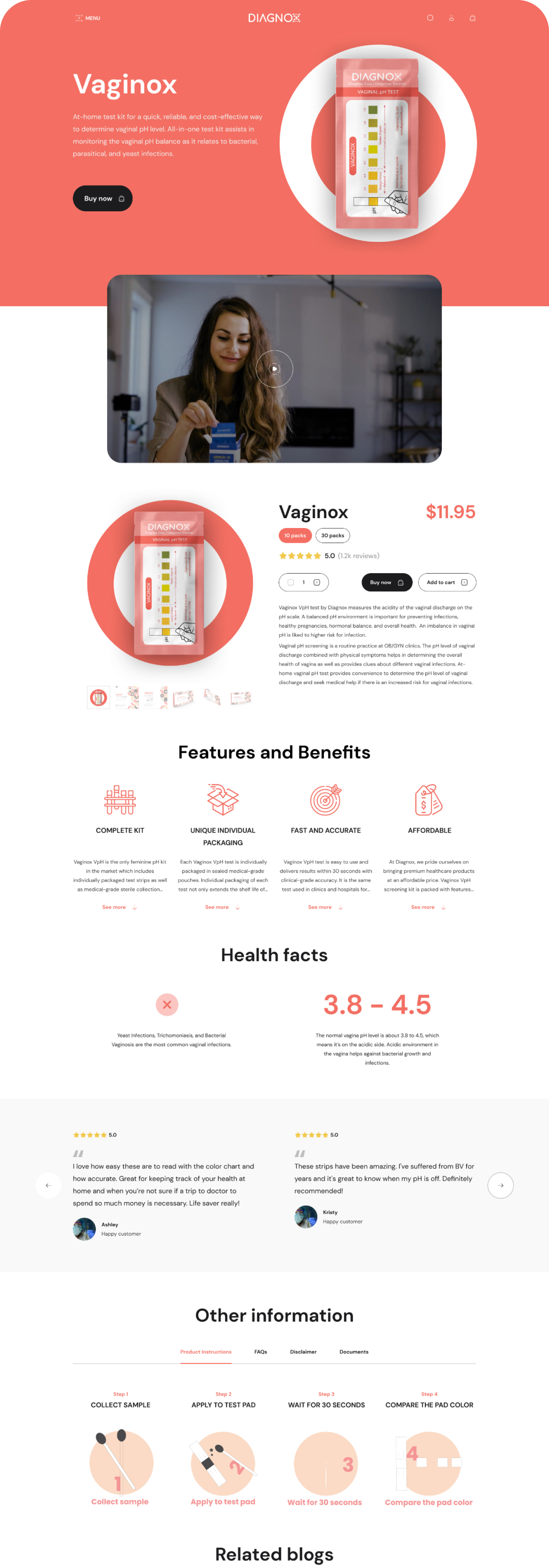
  • Purpose-led opening message
  • Clear feature and benefit layer
  • Health facts before instructions
  • How-to sequence and related education
Figma source · 4× exportComplete high-resolution Vaginox product page from the Diagnox Figma source
Health education, reassurance and purchase clarity in one sequence.
04 / Multi-parameter testing

Urinox-10

Deep blue anchors the parent brand and introduces the broadest monitoring product through a product-led homepage handoff.
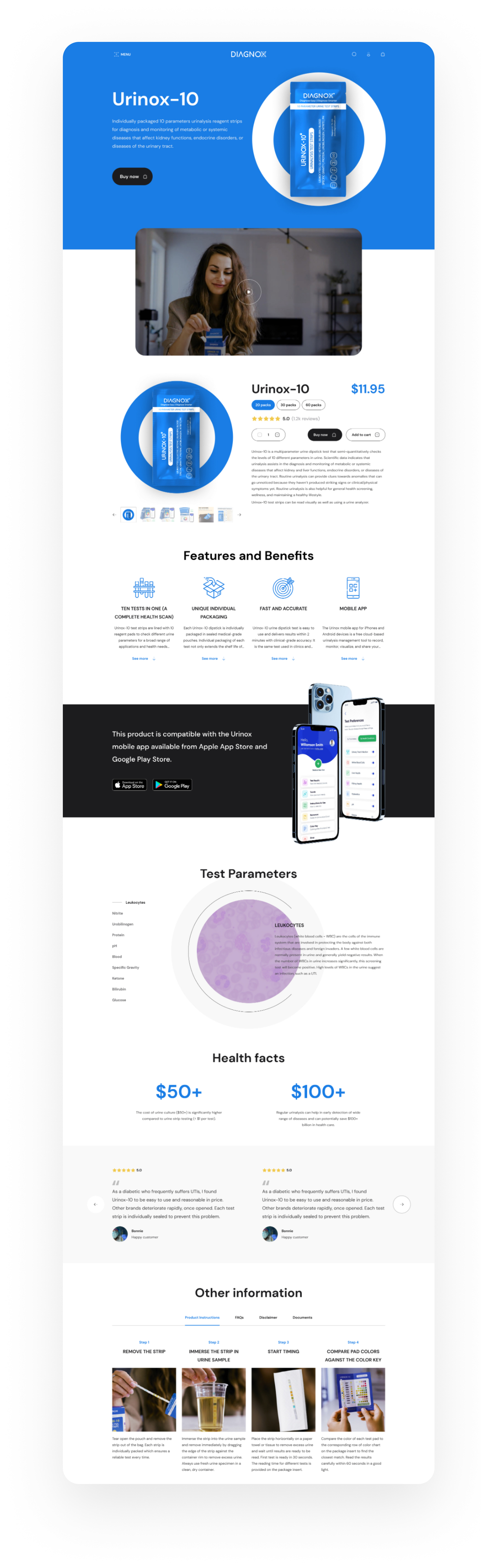
  • Product range introduced in context
  • Pack becomes the visual route marker
  • Shared product features explained once
  • How-to guidance remains easy to reach
Figma source · 4× exportComplete high-resolution Urinox-10 product page from the Diagnox Figma source
Multi-parameter product route from selection through use instructions.
Information compression

Dense test data became a calm decision tool.

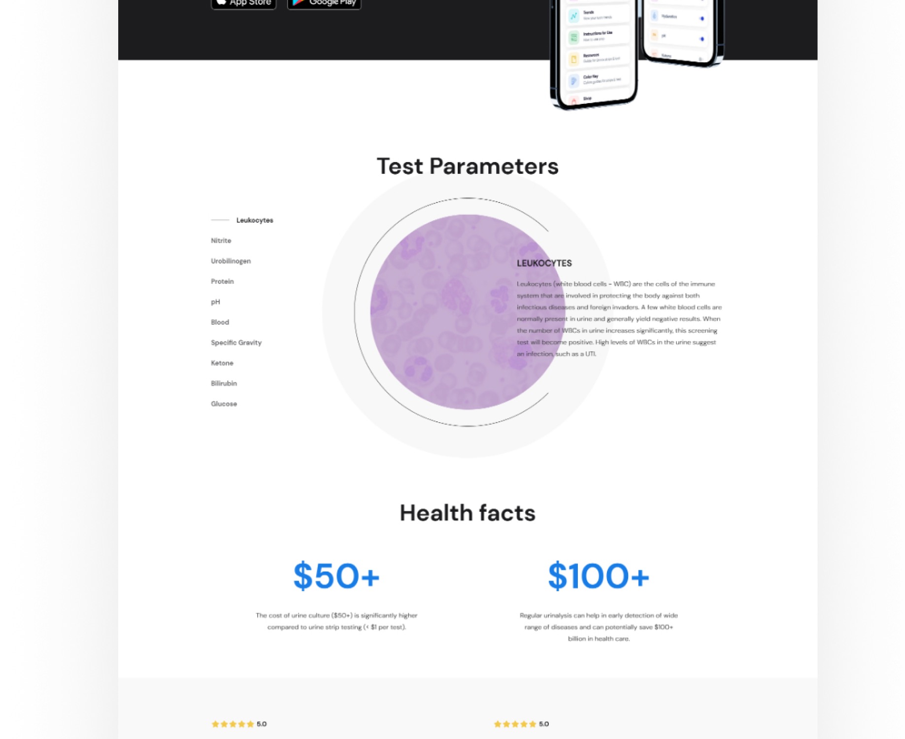
UTI Test needs two parameters. Urinox-10 needs ten. Instead of making customers scroll through repeated clinical copy, I organised the information as a compact, product-specific tab system.
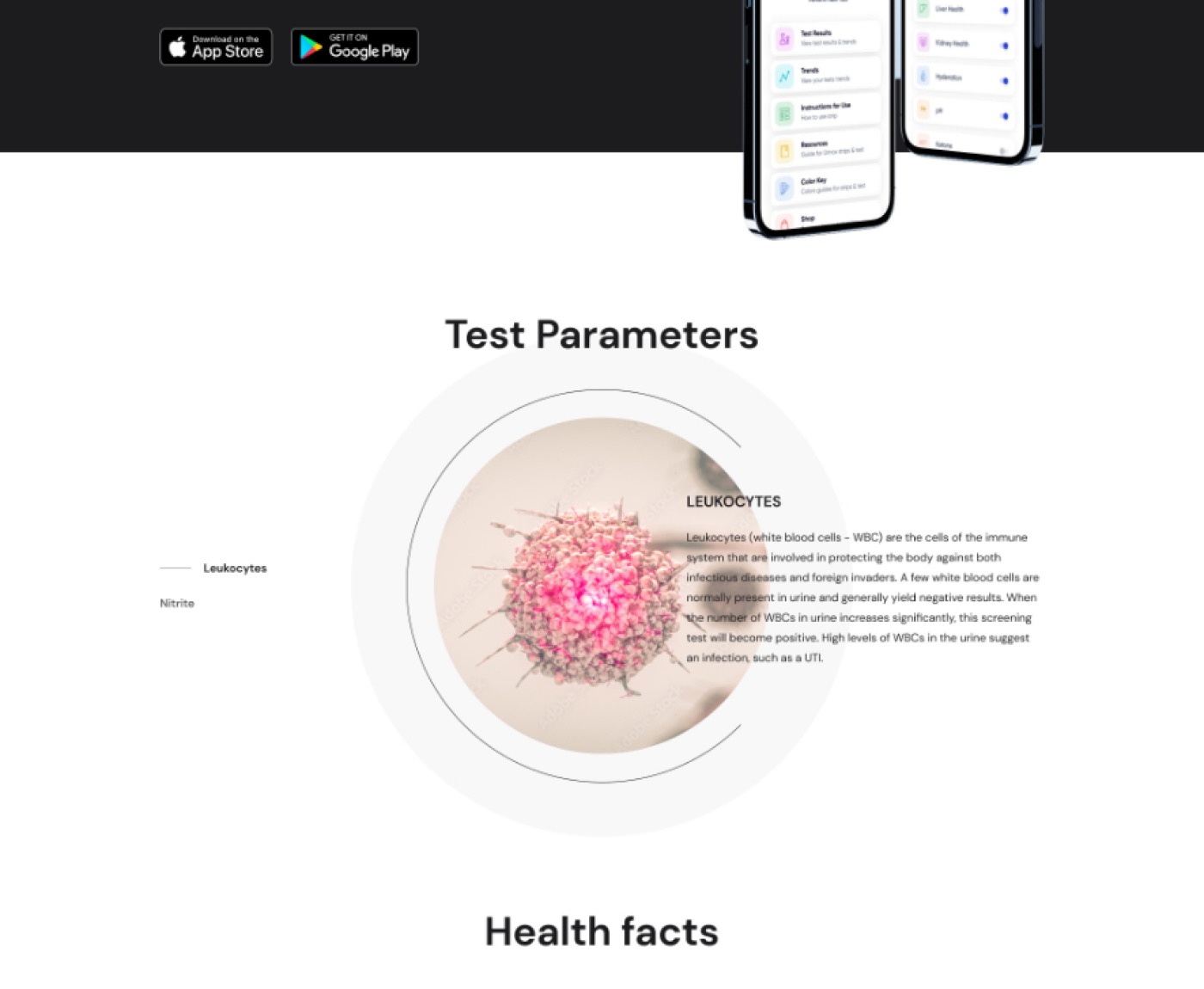
Figma product evidenceProgressive disclosure
UTI Test parameter tabs for leukocytes and nitrite extracted from the Diagnox product design
Source product design · UTI Test
Focused information

Only the evidence this product needs.

Two clear parameter tabs keep the UTI explanation specific. The customer can compare Leukocytes and Nitrite without leaving the buying context.

LeukocytesNitrite
Client-reported outcome2×website salesFollowing the full commerce redesign
Why the redesign converted more naturally

Better design made the next decision easier.

This was a design-led commerce redesign, not a separate CRO programme. The reported lift followed the combined experience rather than one isolated module.

01Clearer choice

Health concern, pack, price and purchase action share one readable hierarchy.

02Less clinical friction

Tabs compress detailed education without hiding the breadth of each test.

03More confidence

Features, parameters, health facts and instructions answer objections before checkout.

Decision journey

Five questions. One confident choice.

Each module removes one layer of uncertainty, moving the customer from recognition to long-term product use.

Relevance

Is this for me?

The health need and product appear together.

Purchase

What do I get?

Pack, price, options and action share one zone.

Evidence

Why trust it?

Benefits become test parameters and health facts.

Use

What happens next?

Guidance makes the first test feel manageable.

Support

Where can I learn more?

Instructions, FAQs and related education remain easy to reach.

Webflow content system

The CMS mirrors the product-page logic.

A shared content model keeps the family consistent while allowing each product to own its specific facts, media, instructions and proof.

Product collectionOne reusable entryCore identity + product-specific content
IdentityPack, colour, health concern
CommercePrice, variants, purchase action
EducationFeatures, facts, parameters
SupportVideo, instructions, FAQs
ProofReviews, guidance, related content
Desktop tabsOne content sourceMobile slider
Motion direction

Movement behaves like a guided clinical handoff.

The motion system preserves context while moving visitors from family to product, then from product to evidence.

01 / Family signal

Colour confirms context

Product changes carry the family colour through the transition, so the new state is understood before every label is read.

02 / Pack focus

The product stays the anchor

Pack imagery moves from range overview to product detail as a continuous visual handoff.

03 / Progressive evidence

Detail arrives in layers

Features, health facts and instructions enter as the visitor reaches them, matching the order of buyer questions.

04 / Responsive continuity

Tabs become a touch slider

Custom JavaScript adapts desktop product navigation for smaller screens while preserving the same content source.

“I couldn't ask for a better experience. The communication was great.”

Diagnox Health
Delivered system

A healthcare store designed around informed decisions.

The final work connects product identity, clinical education, commerce hierarchy, responsive interaction and maintainable Webflow content. It gives each Diagnox product a branded world while keeping the full range easy to learn, buy and manage.

4Distinct product families
1Shared content architecture
3Public design recognitions
Your next project

Connect product information with a clearer buying journey.

Tell me what your customers need to understand or do. I’ll recommend the work, set the scope and stay accountable for delivery.

Talk now ↗
Explore more work ↗See how we can work together ↗