Give every message a level.
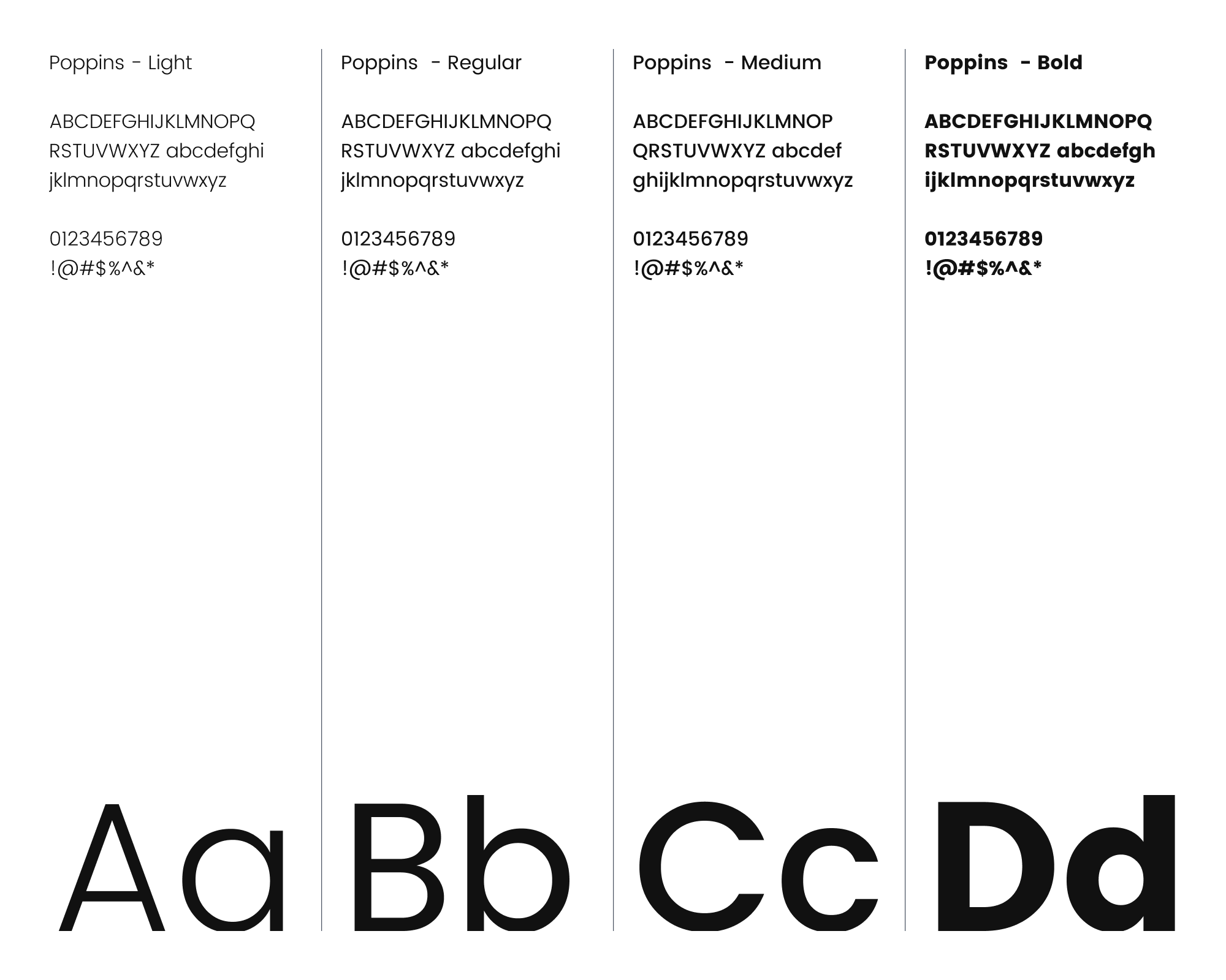
Poppins Light and Regular create room for longer passages. Medium and Bold establish labels and key messages. A small set of weights keeps new materials recognisable.
Brand identityAI SaaS · Creator tools
A distinctive identity for an AI writing product built around the creator’s own voice. I shaped the mark, typography, colour and imagery around one idea: text that gives life.
Explore the identity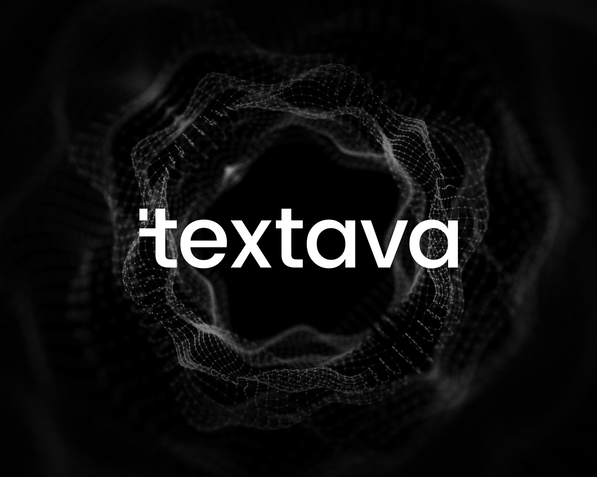
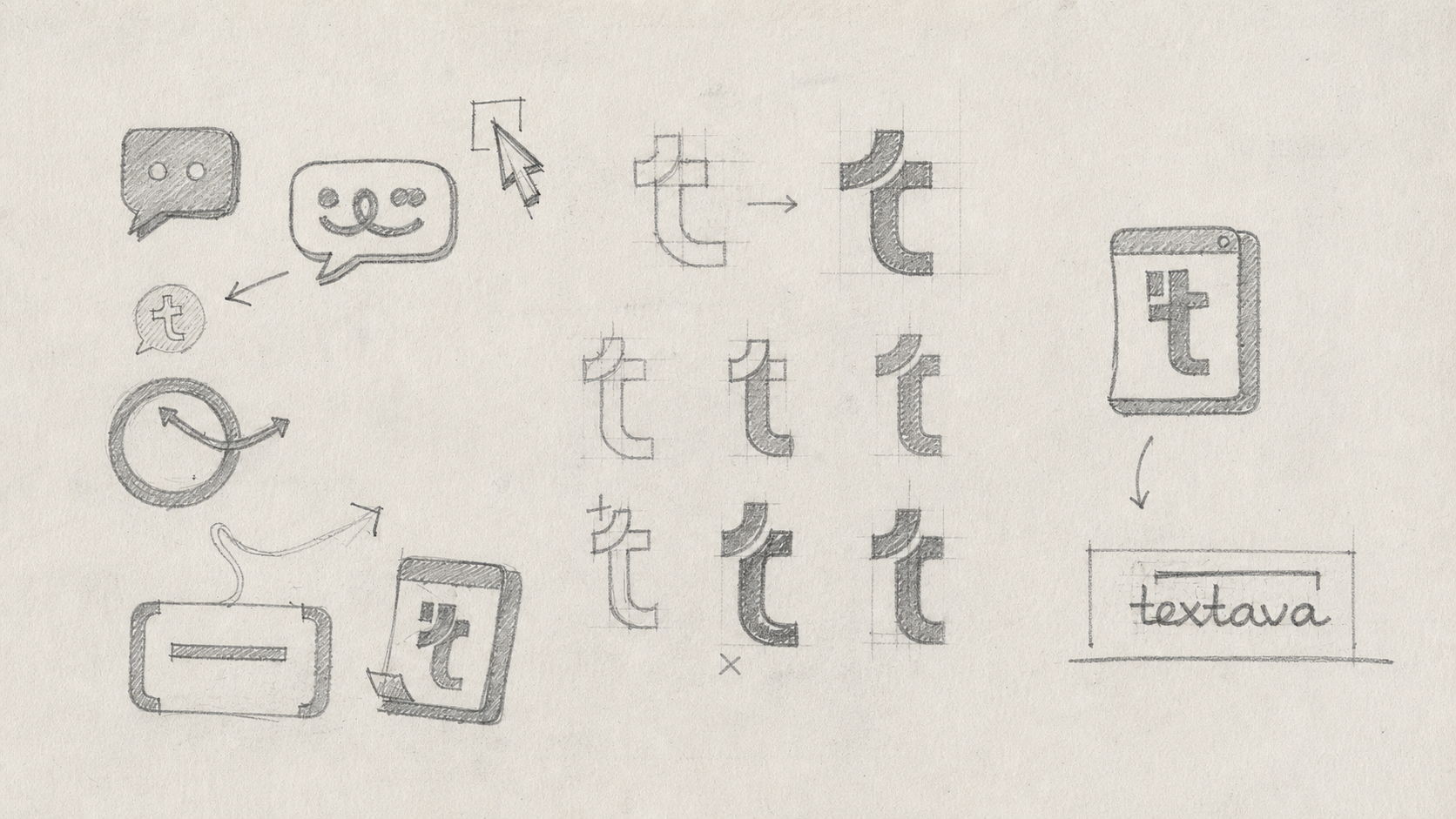
AI writing is a crowded category. I started with communication symbols and a lowercase letterform, looking for an identity that could feel precise and human. The exploration connects speech, text and the movement from an idea to something worth sharing.
02 / Logo system
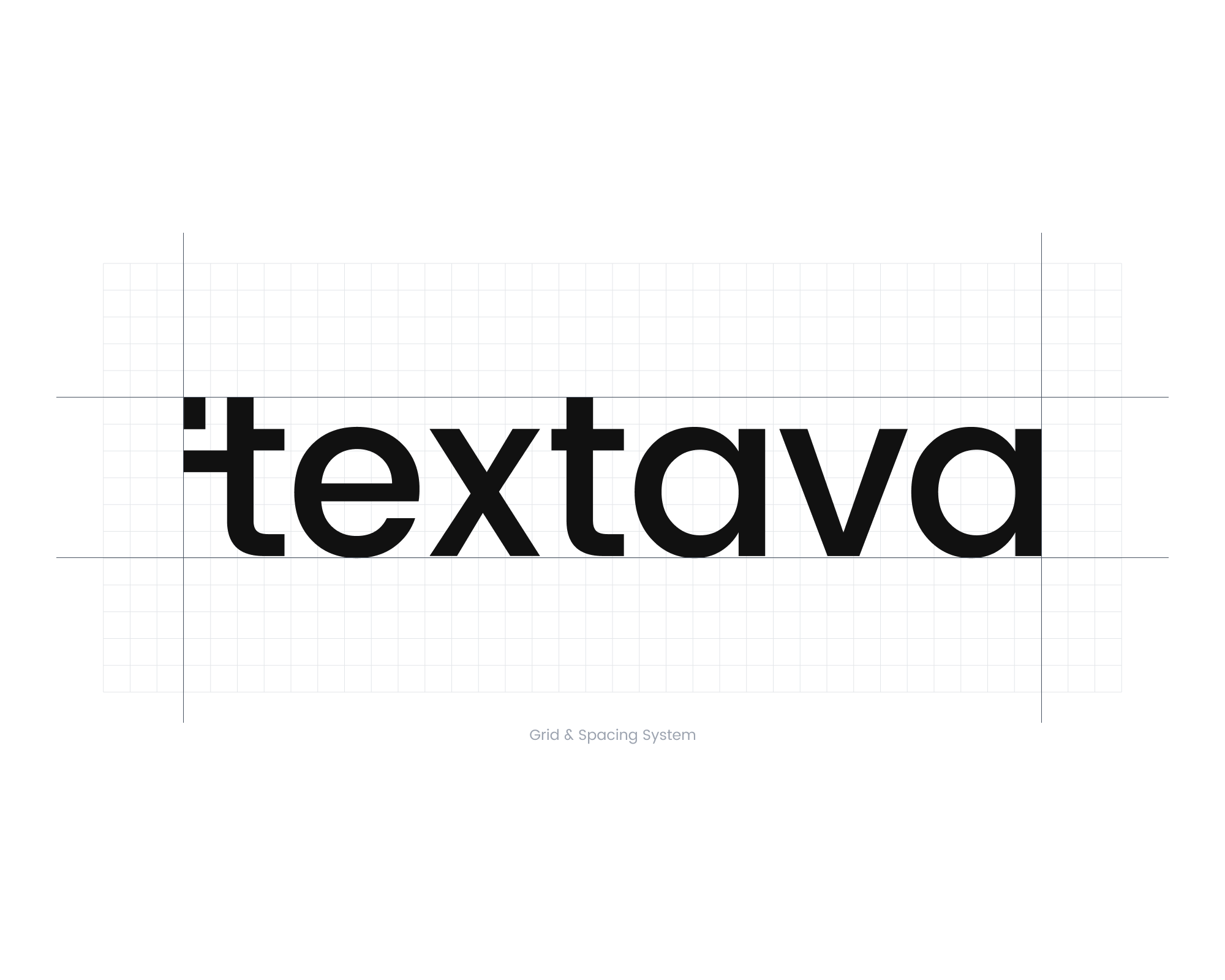
The lowercase wordmark keeps the name approachable. The distinctive opening “t” gives the identity an anchor that can also work on a small digital surface.
The construction sheet makes the relationship between the symbol, letters and surrounding space visible. That consistency matters when the identity moves from a business card to a browser or a launch graphic.
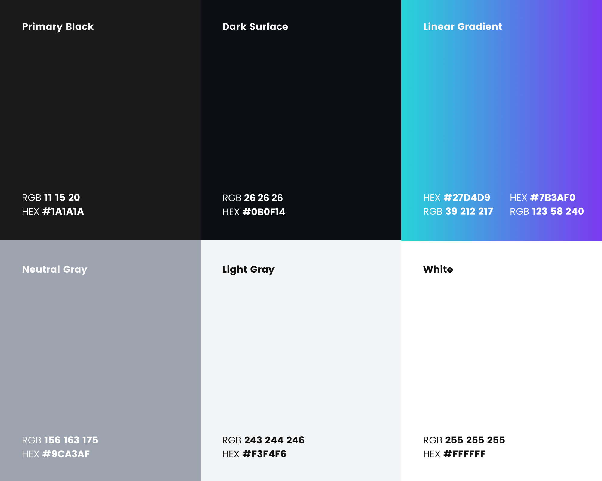
Poppins gives the system a consistent typographic voice. Neutral surfaces leave space for the content, while the cyan-to-violet gradient gives the brand a distinct expressive range.
Poppins Light and Regular create room for longer passages. Medium and Bold establish labels and key messages. A small set of weights keeps new materials recognisable.
Black, dark surface and light neutrals carry the reading experience. Cyan and violet add emphasis in the gradient, leaving the surrounding composition calm.
The mesh suggests thoughts taking shape; the modular illustrations explain practical concepts. Each has a different job, so expressive artwork can coexist with clear information.
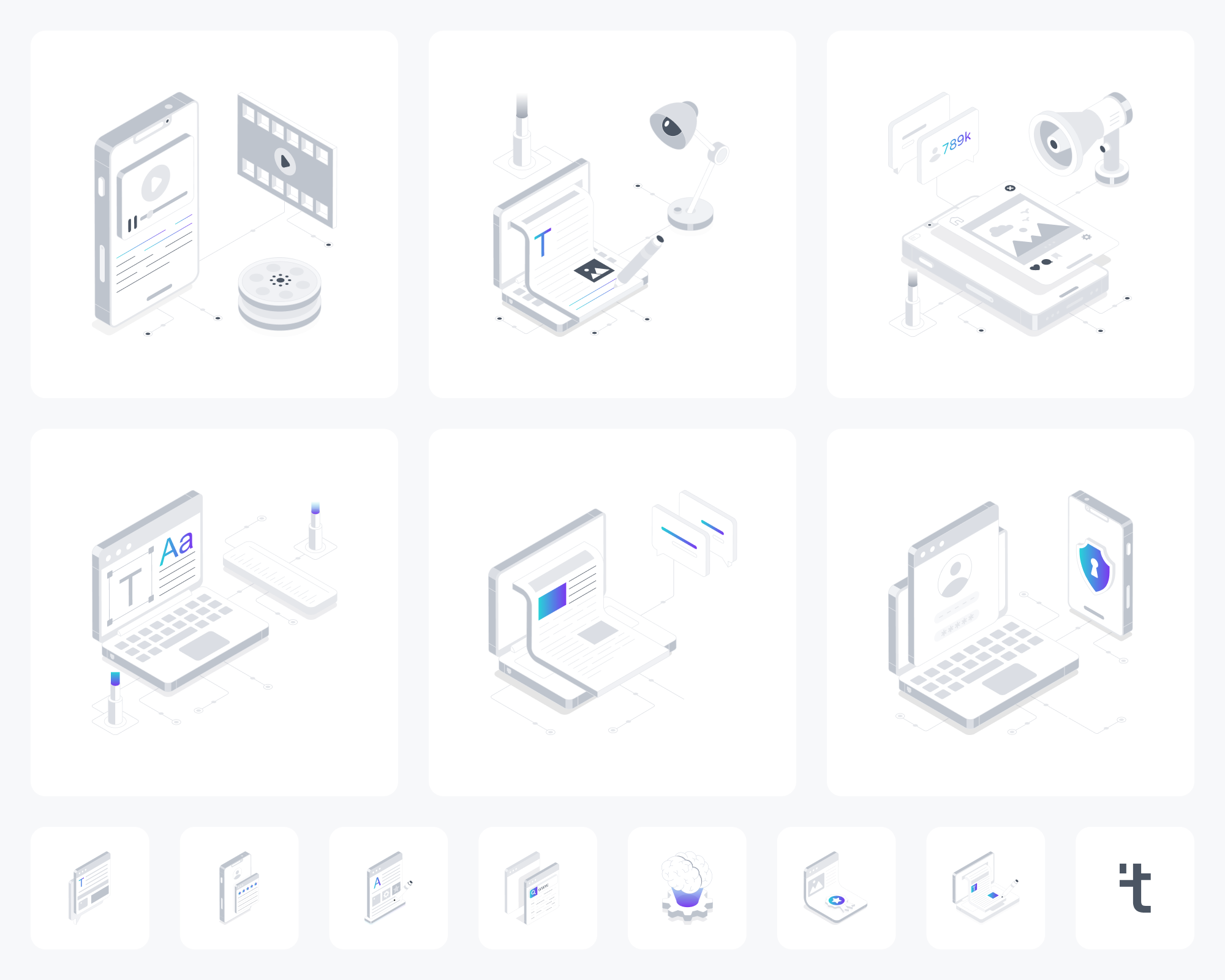
The modular illustration language gives content creation a physical vocabulary. Familiar objects, depth and a restrained palette connect the expressive brand world to practical product concepts.
The identity is tested across business cards, workplace materials and digital touchpoints. Consistent type, contrast and the mesh signature connect these surfaces while allowing each composition to serve its own purpose.
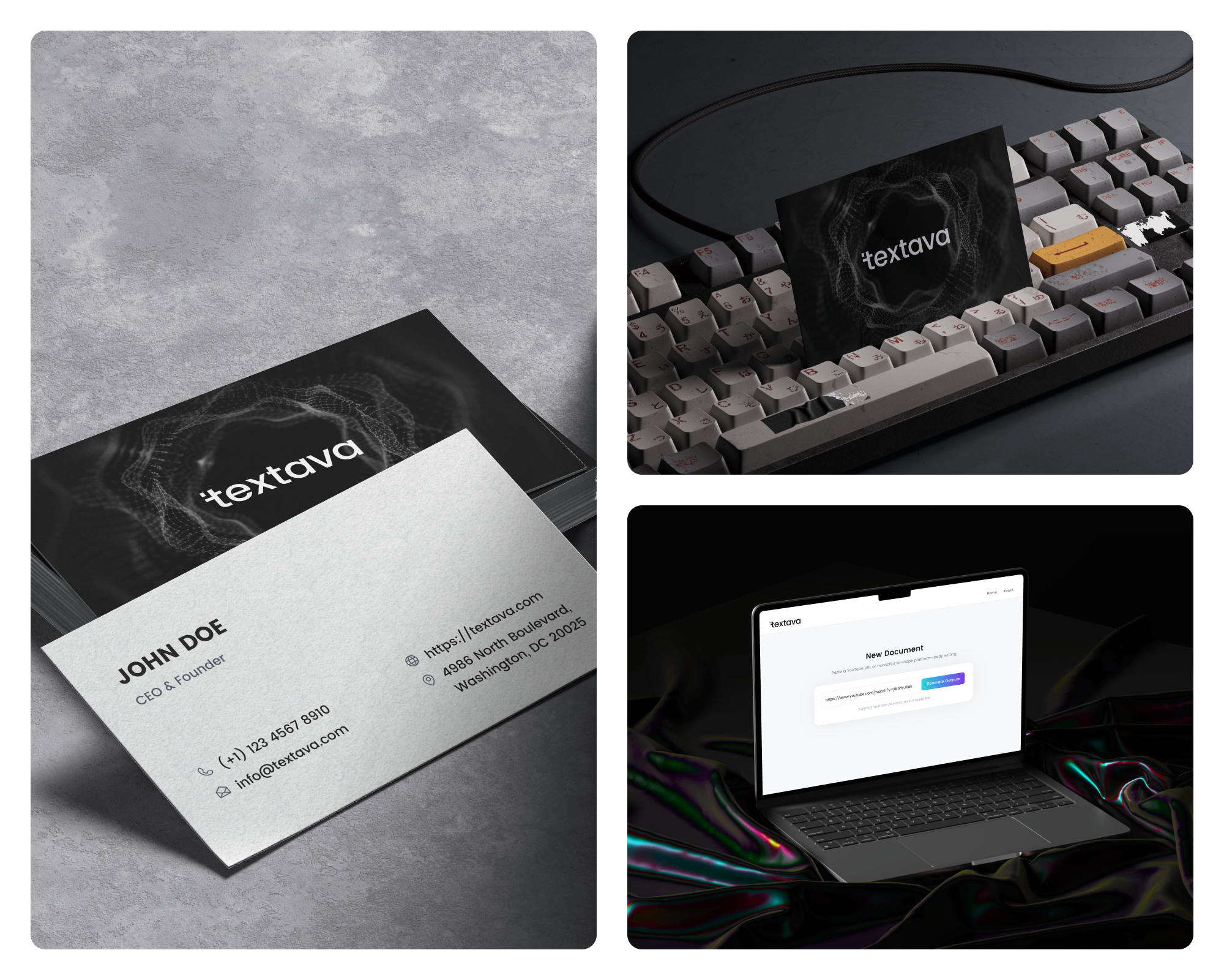
A consistent identity across print, workplace and product touchpoints.
Your next project
Send me your idea in your own words. I’ll review your brief and help shape the next step.