Brand identityWellness · Red light therapy
Thrive Brand Identity
I developed Thrive’s wellness identity from the first pencil explorations to a complete visual system. The work connects science, light and wellbeing through a recognisable mark and a practical family of brand applications.
See how the brand took shape- My role
- Concept exploration, Logo design, Visual identity, Brand guidelines
- Platform & tools
- Figma · Brand guidelines
- Delivered
- A wellness identity ready for print, digital and campaign use

01 / Starting on paper
Find the idea before refining the form.
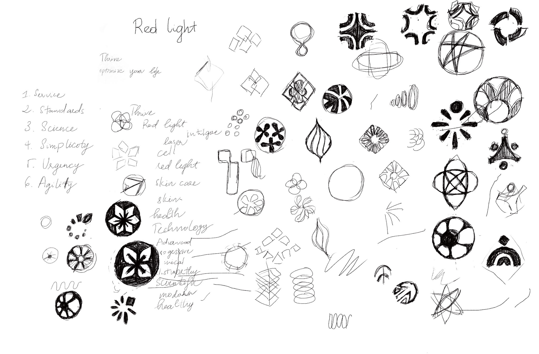
I explored what the brand could stand for before choosing a symbol. My original pencil sheet connects science, light, cells and wellbeing with possible shapes, from radiating forms to linked circles and human figures.
02 / Exploring directions
Make the choices visible.
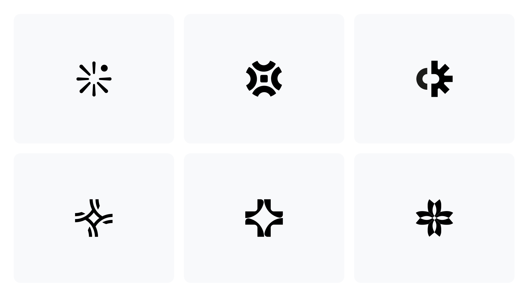
The early presentations developed several distinct directions: a burst of light, a soft medical sparkle and a more organic symbol. Each was explored as a logo and in context, with colour, imagery and possible sub-brand names.
This made the discussion tangible. We could compare how a direction communicated, how it looked on a small screen and whether it could support a wider wellness brand. These are exploratory routes; the final identity follows below.
03 / The final mark
A network of possibilities. One recognisable mark.
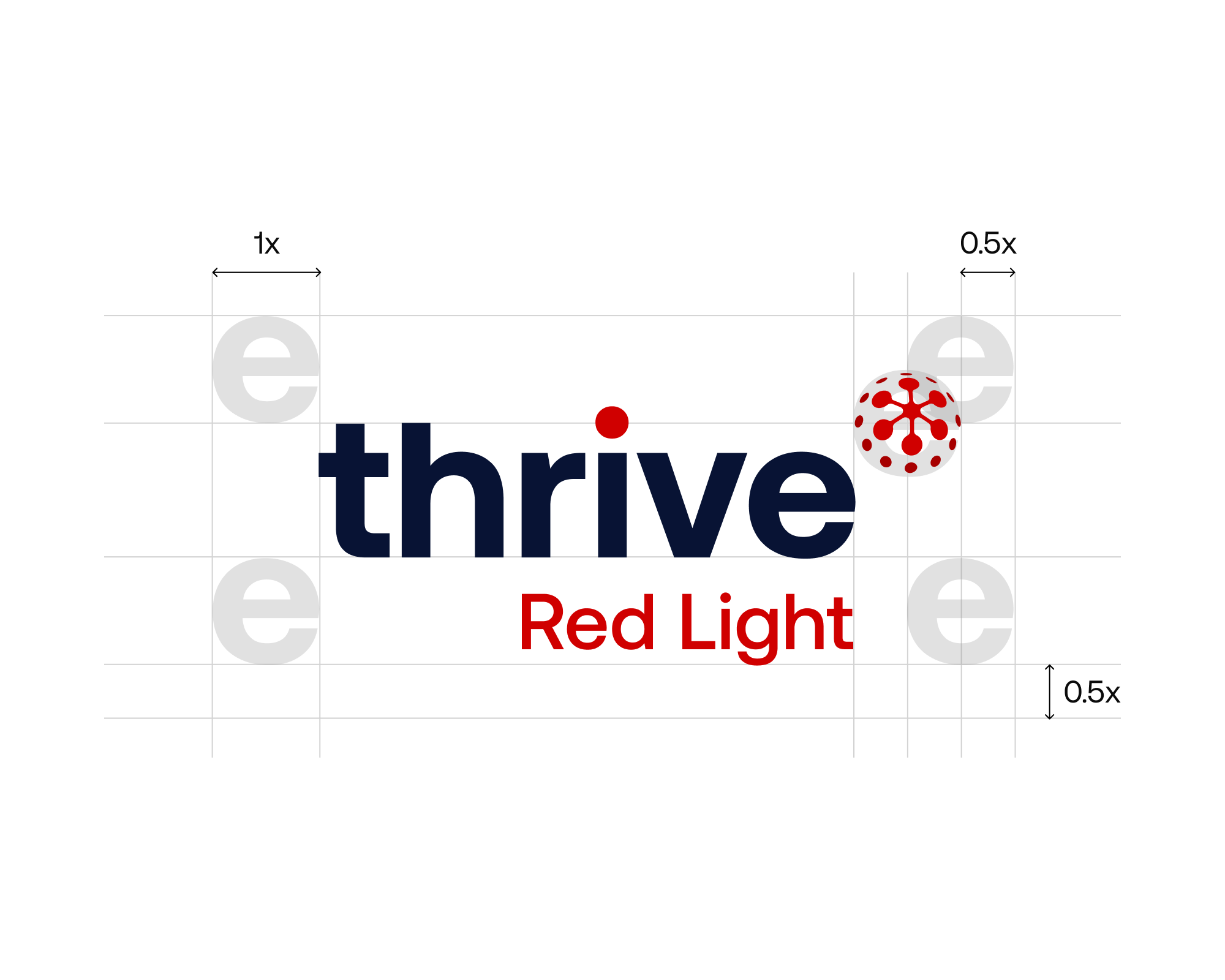
The selected spherical symbol gives Thrive a connection to life sciences. Its repeating nodes suggest a connected biological system, while the simple wordmark keeps the name easy to read.
I defined the lockup and clear space using the letter E as a reference. That practical rule keeps the symbol, wordmark and Red Light descriptor balanced when someone else applies the brand.
04 / Brand architecture
Let Red Light belong to a bigger Thrive.
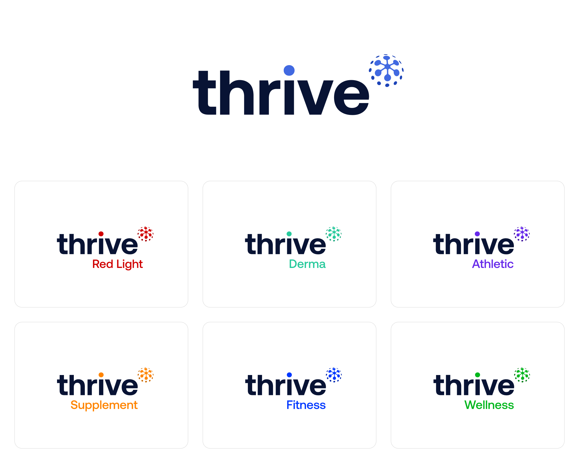
The identity presentation extends the same mark and wordmark across Red Light, Derma, Athletic, Supplement and Wellness. The shared structure makes the relationship visible; the descriptor identifies the offer.
These applications show how the identity can accommodate a broader range. Red Light has its own colour emphasis, while the core Thrive name remains the visual anchor.
05 / Colour and typography
Give every application a common language.
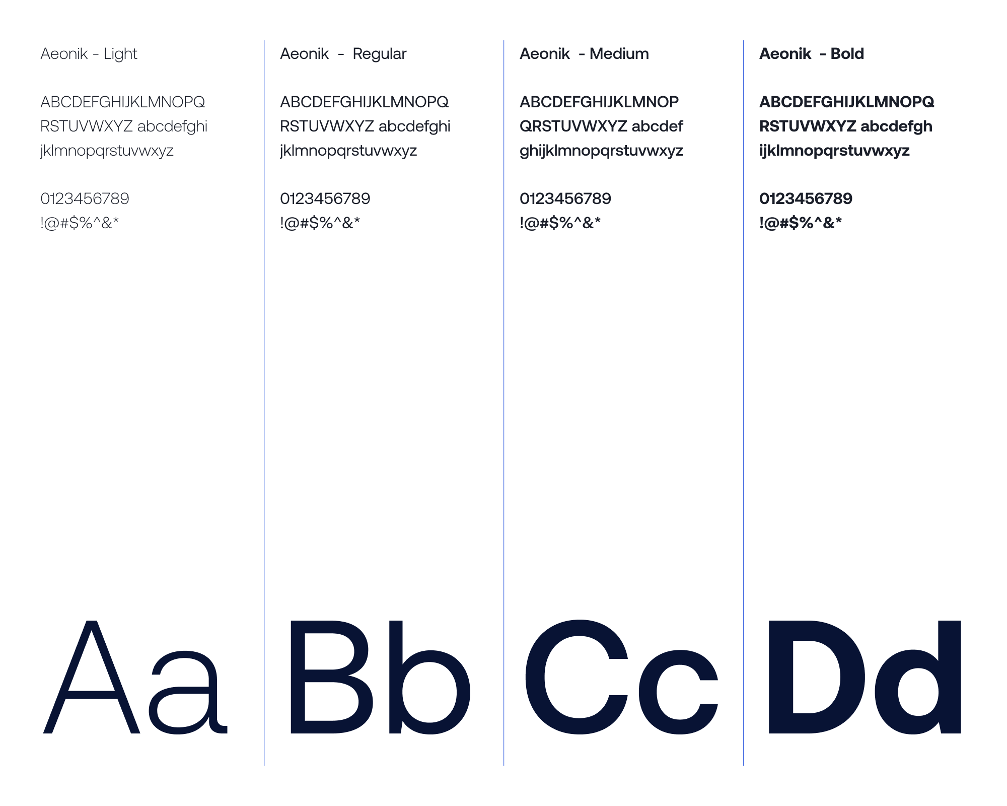
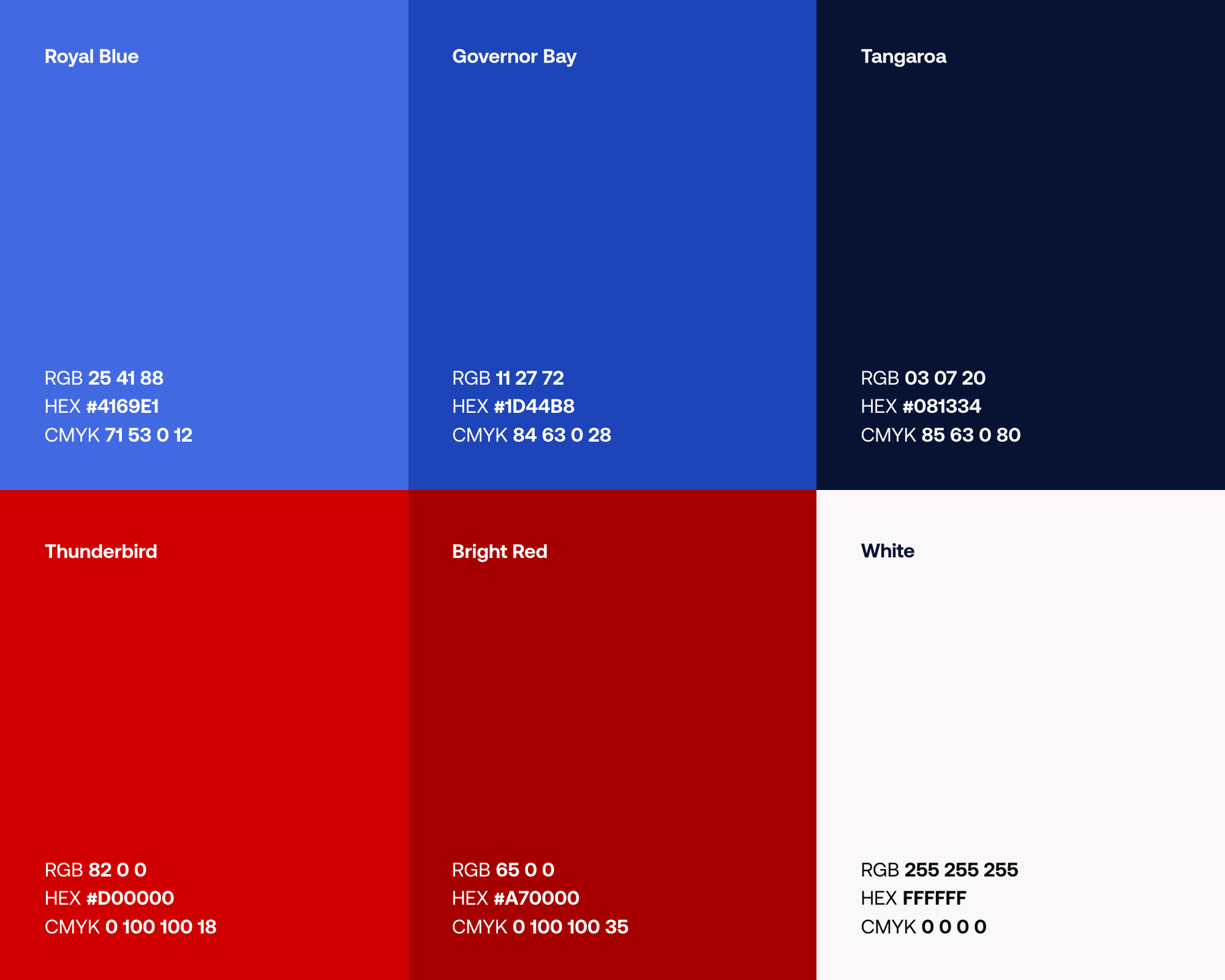
The final presentation pairs Aeonik with a blue parent-brand palette and red accents for Red Light. The guidelines also specify Montserrat as a practical alternative. These choices give future materials a clear starting point, from type hierarchy to contrast.
06 / A usable logo system
Keep the identity clear wherever it appears.
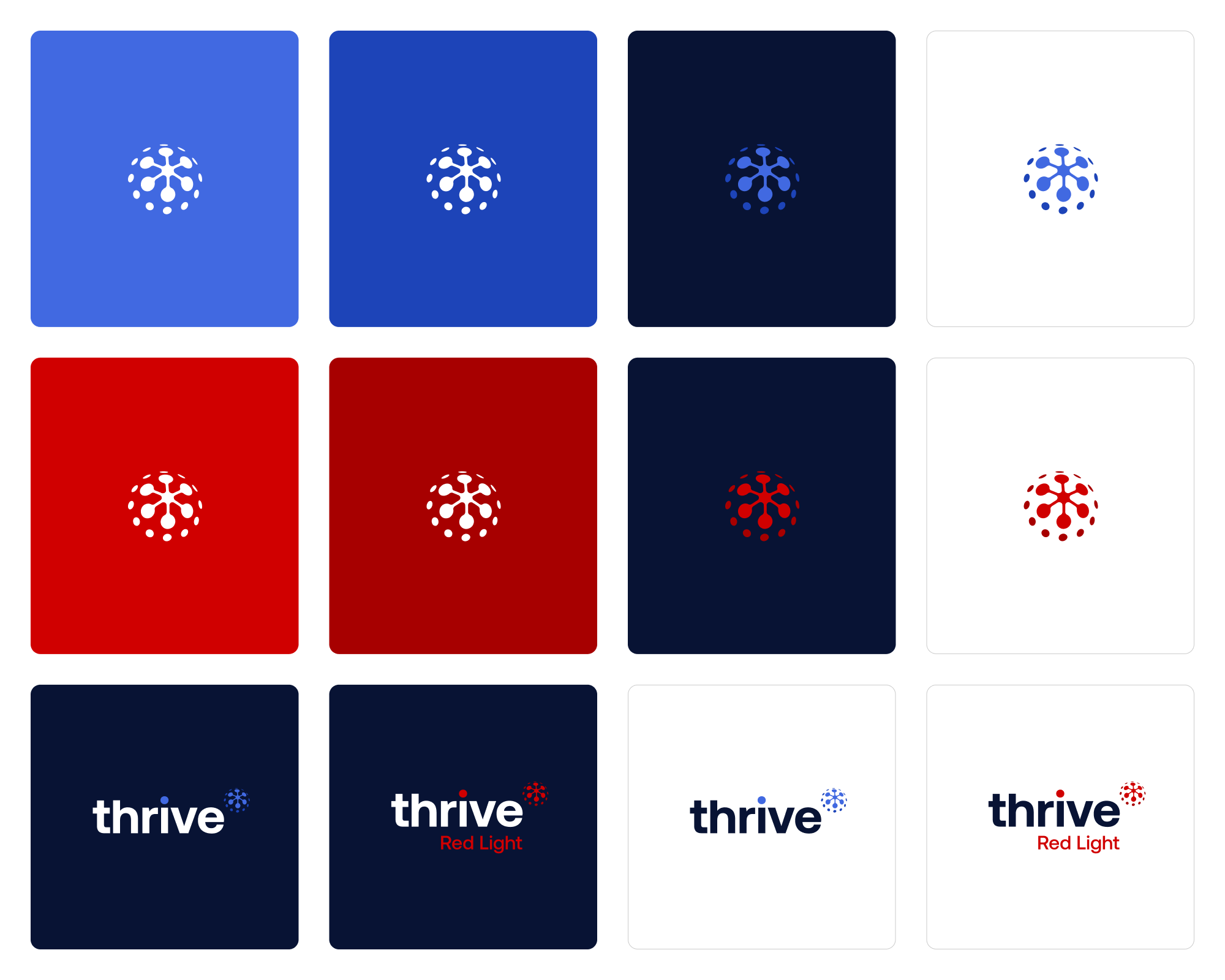
The logo was supplied in colour, black and white, as a full lockup and as a standalone mark. The guidelines cover contrast, clear space and incorrect uses so the artwork can move between backgrounds without losing its character.
The smaller symbol can carry the identity where the full name would be cramped. On larger applications, the wordmark brings the name back into focus.
07 / Putting the identity to work
A brand people can recognise across touchpoints.
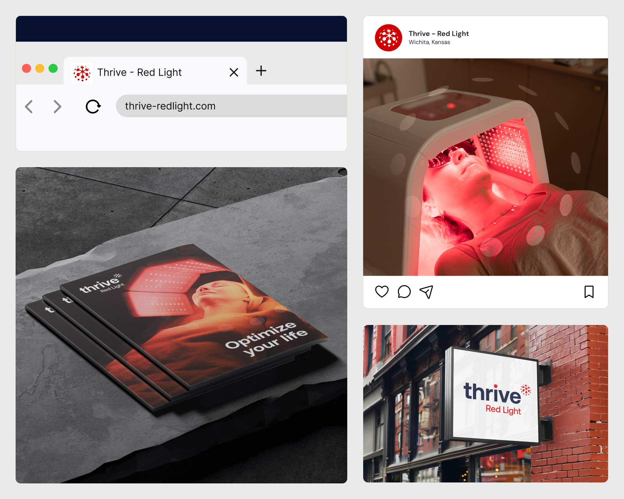
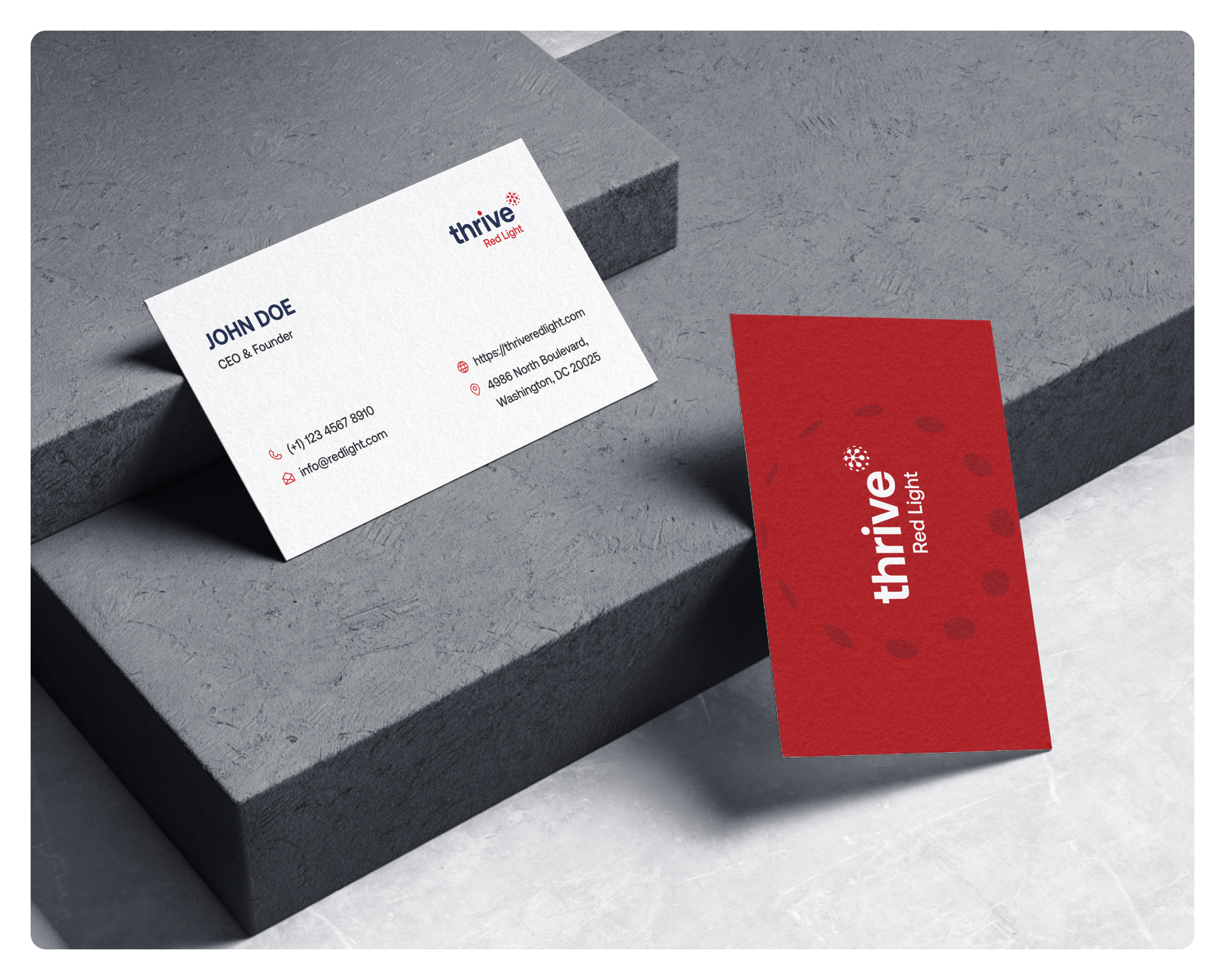
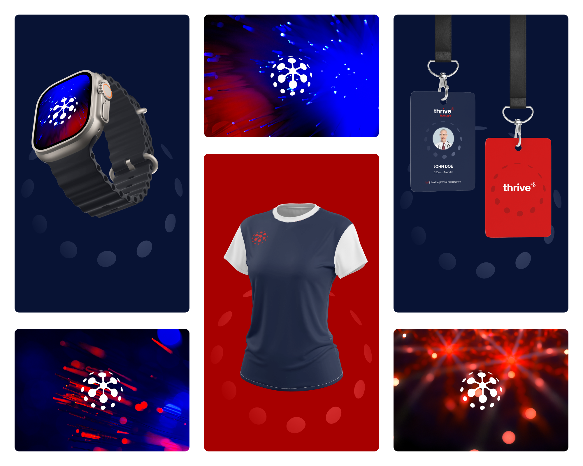
I applied the identity to digital, print and environmental mockups. The light imagery gives each piece atmosphere, while consistent logo placement and typography hold the presentation together. These are design applications from the original brand presentation.
08 / Campaign expression
Let the light carry the message.
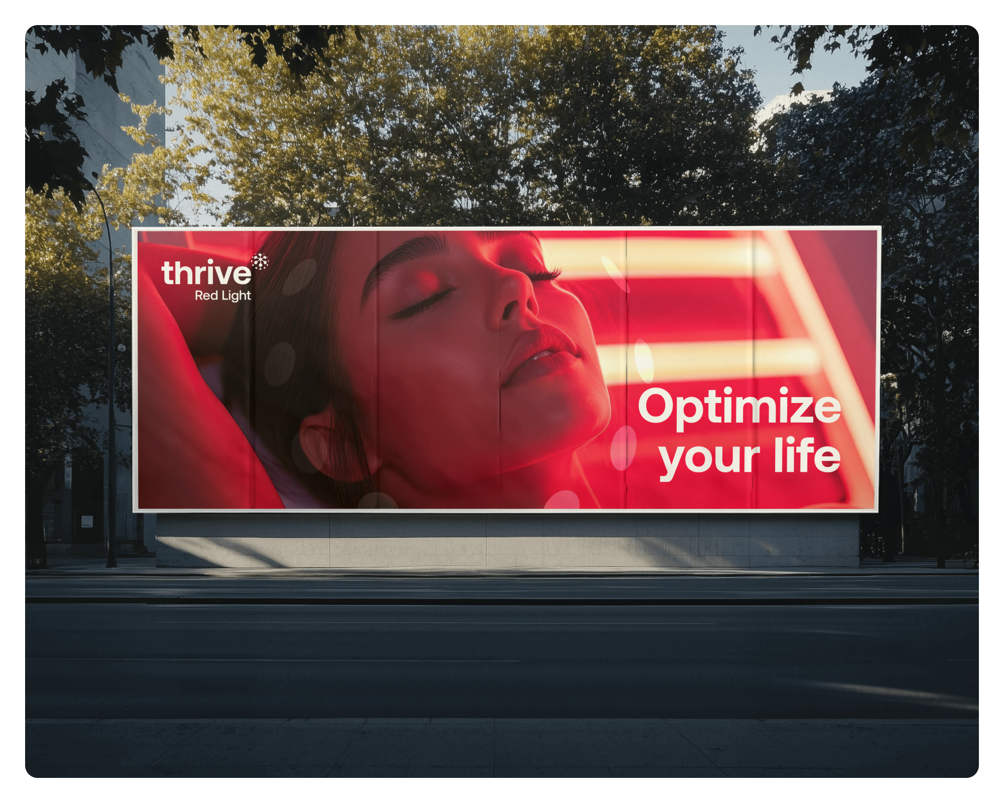
The campaign presentation brings the brand into a more human setting. A large image, a short headline and a clear mark give the viewer a simple entry point.
The billboard mockup tests the identity at a distance. Its hierarchy is deliberately different from a business card or a product page: recognise the brand, understand the message, then find the next step.
The client’s experience
From design decisions to a Shopify launch.
The client describes the wider brand and store engagement, including website design, custom Shopify development and launch.
- 01Finding the brand direction
- 02Building a consistent identity
- 03Taking the store to launch

Your next project
Build a wellness brand people recognise.
Send me your idea in your own words. I’ll review your brief and help shape the next step.